Clarity · system sample · Figtree (Good.Lab face) · pure white canvas, cool grey alternates, pill actions, hairline structure
Type scale
Manage sustainability as well as you manage finance.
Complex challenges. One trusted partner.
We need audit-ready reporting.
We need reliable sustainability data.
From double materiality to ESRS disclosure and assurance preparation, we build reporting that stands up to scrutiny.
72 / 48 / 34 / 22 / 17.5 / 15 · weights 600 (display), 500 (labels, questions, actions), 400 (body) · tracking tight on display sizes onlyColour roles
Whitecanvas, hero, challenges, cards
Cool greyalternate sections: trust band, capabilities
Flagship blacktext
Flagship redCTA, links, active state, data point
Platform greenPlatform context and data lines
Academy blueAcademy context
Platform tintPlatform panel surface
Academy tintAcademy panel surface
Hairlinethe only divider
No warm white anywhere (DEC-021). No boxes with borders except the capability panels. Hairlines are the structure.
Actions
Header
 Contact
84 px, logo left, navigation centred at 15 px weight 500, pill Contact right, hairline below
Red dot functions
brand markerReporting & Disclosureaction marker
progress (Academy panel)
Active questionactive state (selector)
data point (Platform panel)
Question selector, row states
We need audit-ready reporting.
We need reliable sustainability data.
We need sustainability to support business strategy.
Active: red 2 px left rule, red 8 px dot, black text.
Hover: black text, grey dot.
Inactive: ink-50 text, grey dot.
Rows separated by hairlines, 22 px weight 500, column 440 px with a hairline on its right. Switching is CSS only (radio inputs and :checked), no JavaScript.
Hover: black text, grey dot.
Inactive: ink-50 text, grey dot.
Rows separated by hairlines, 22 px weight 500, column 440 px with a hairline on its right. Switching is CSS only (radio inputs and :checked), no JavaScript.
Logo tooltip

Mattoni 1873Case study

VeoliaClient

Amazon EuropeCase study
Pure CSS :hover on the logo wrapper. White card, hairline border, soft shadow, caret. Second line is "Case study" (red, dot) where a case exists, otherwise "Client". No quotes invented.
Browser-chrome card
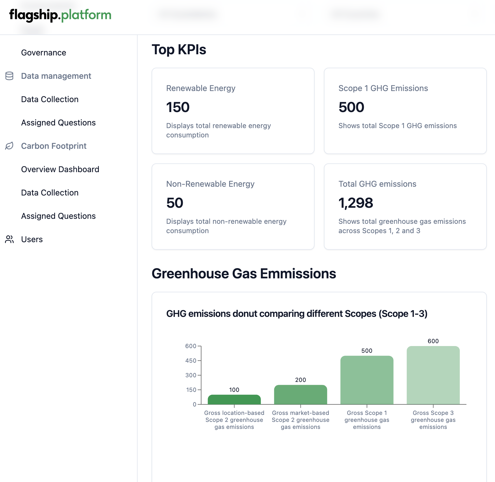
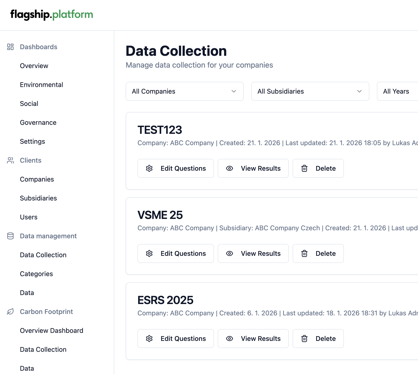
Real Platform screenshot in a white card: 38 px grey top bar with three dots and the address pill, radius 14, hairline, soft shadow. In the hero it is 720 px wide and overlaps the media stage by 60 px. Reusable for case studies and the Platform page.
Data graphics
Trend line, Platform green, red data point at the latest value
Completeness bars, green with the red bar as the attention point
Surfaces
Flagshipwhite, hairline border, radius 18
Platformtint #EAF2EE, no border
Academytint #E9F0F7, no border
Section alternate: cool grey #F4F5F7 full-bleed band (trust, capabilities). Media: radius 16 to 20, no borders.
Image treatment